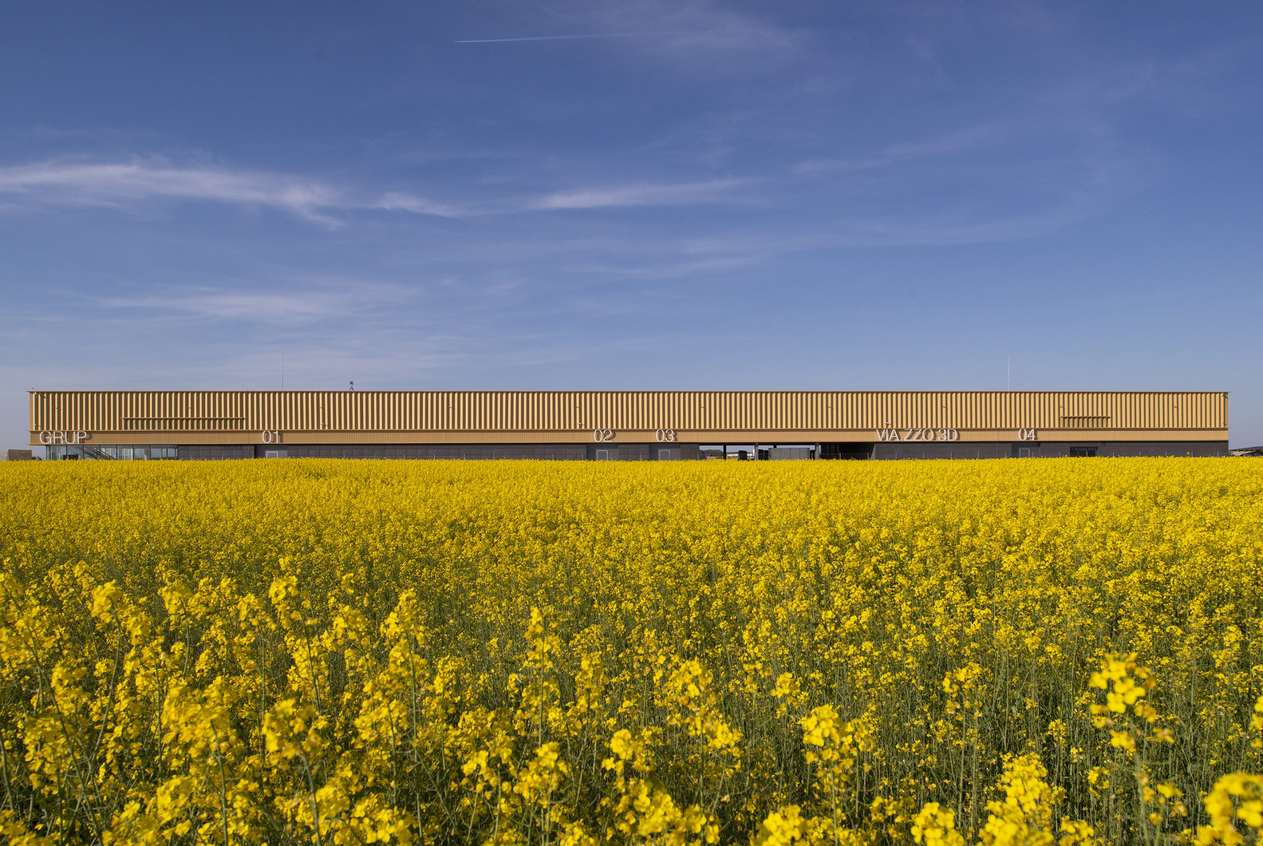
Aragon Grup Headquarters
View project description2023Industrial Aragon Grup Headquarters
2019 – 2023 / Industrial / Aragon Grup Headquarters
2025: Nominee
Aragon Grup Headquarters has been nominated for the European Union Prize for Contemporary Architecture / Mies van der Rohe Awards 2026.
2024: Winner
Aragon Grup Headquarters in Stefanestii de Jos has been awarded the category Prize in the Bucharest Architecture Annual, 2024, Built Architecture / Public Architecture Category
2023: Winner
Aragon Grup Headquarters in Stefanestii de Jos has been awarded the category Prize in the National Biennial of Architecture – Romania, 2023, Industrial, Administrative, Tourist, Sports / Leisure Buildings Category
Location: Stefanestii de Jos, Jud. Ilfov, Romania
Architecture: E+EA – Mihai Ene, Adela Ene
Client: Aragon Grup, Dan Popovici
Structure: Gordias – Botond Zakarias
MEP & HVAC: Custom Plan Engineering – Mihai Rusu
Project management: Lindab Romania – Victor Armie, Aragon Grup – Marius Despan
General contractor: Lindab Romania
Steel structure: Lindab Romania
Metal cladding: Lindab Romania
Terrazzo and industrial flooring: Aragon Grup
Glass façade: Exigere Glass and Aluminium
Photography: Iulius Cristea
The chance to build in a quasi-rural landscape can be both an opportunity and an architectural challenge in equal measure.
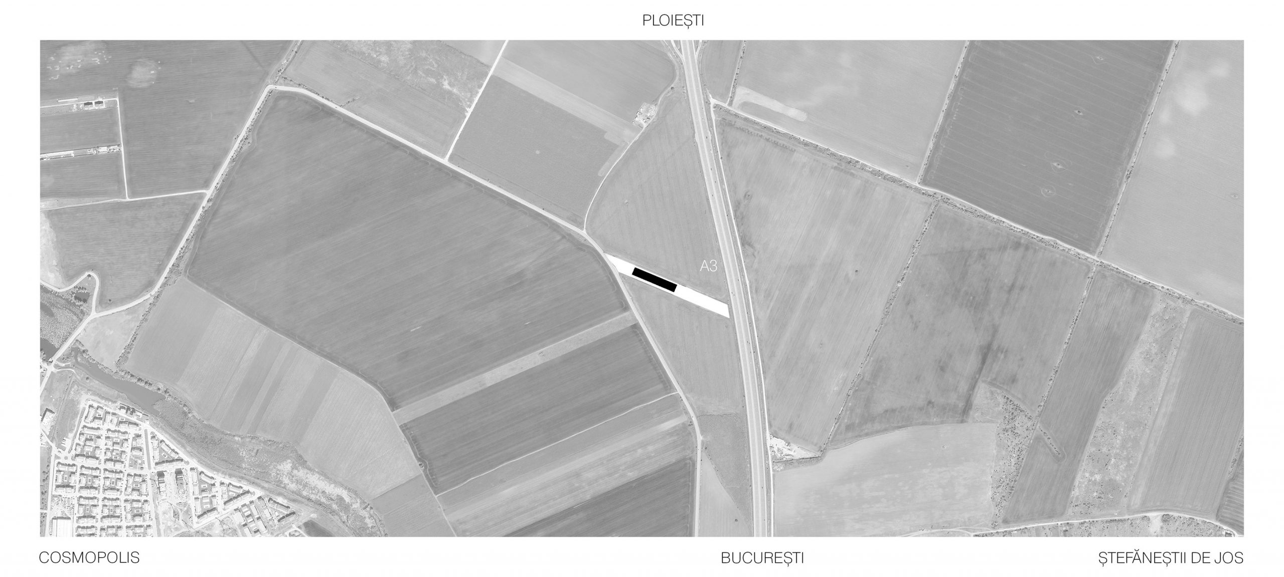
The site, located in Ștefăneștii de Jos, north of Bucharest, close to the A3 highway, is found in an area that is expected to develop in the future as an industrial and commercial territory. Until now, all the land in the surrounding area has been used for agricultural production, specifically for growing rapeseed and wheat, so our intervention is the first of its kind over a very large radius.
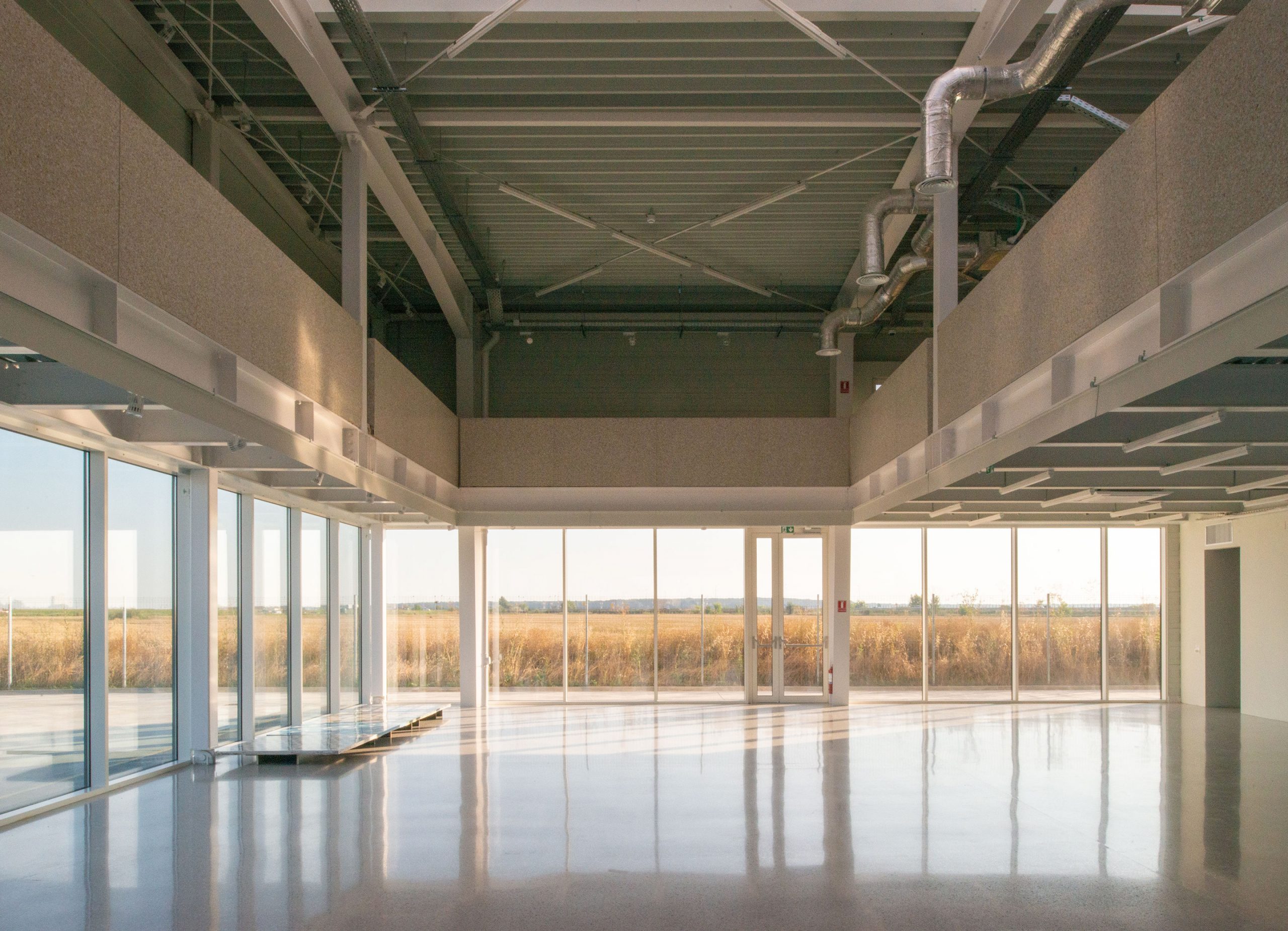
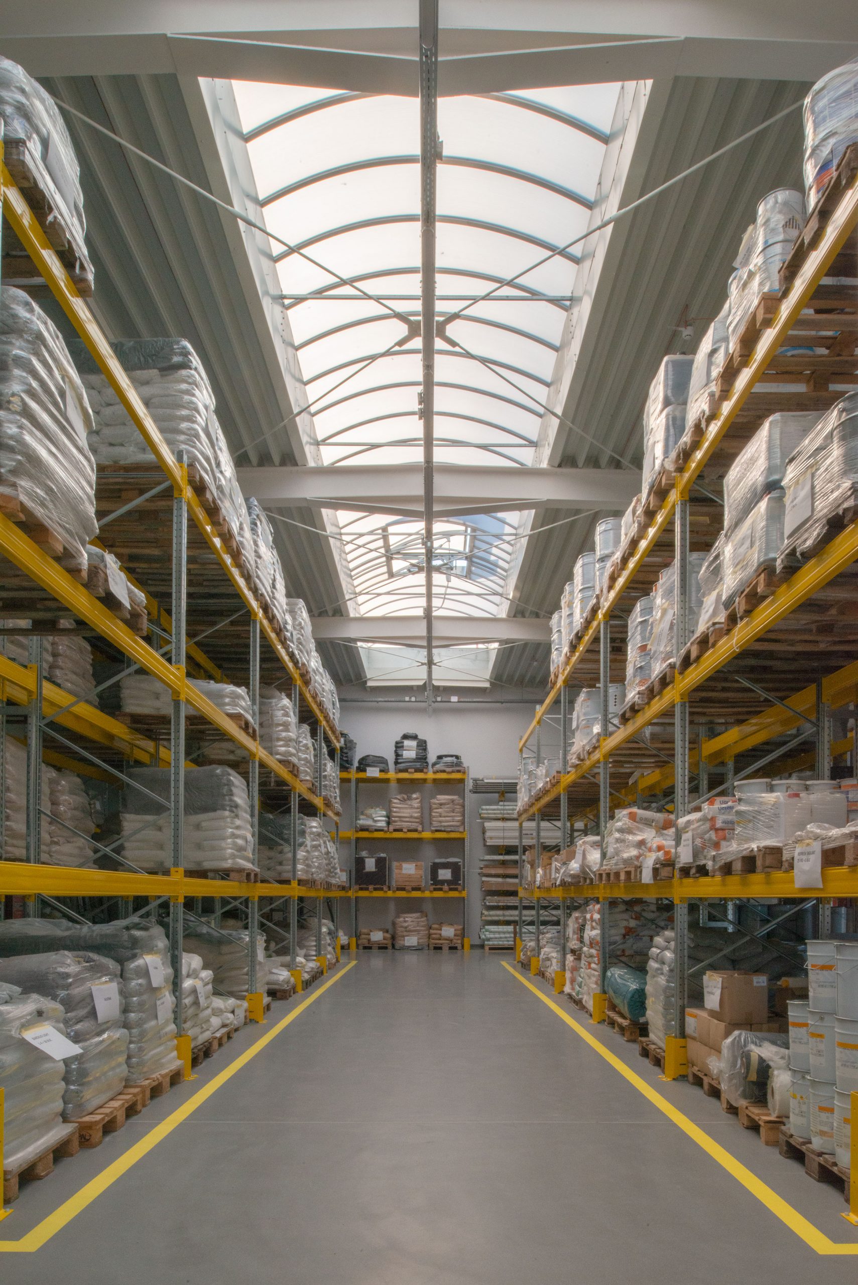
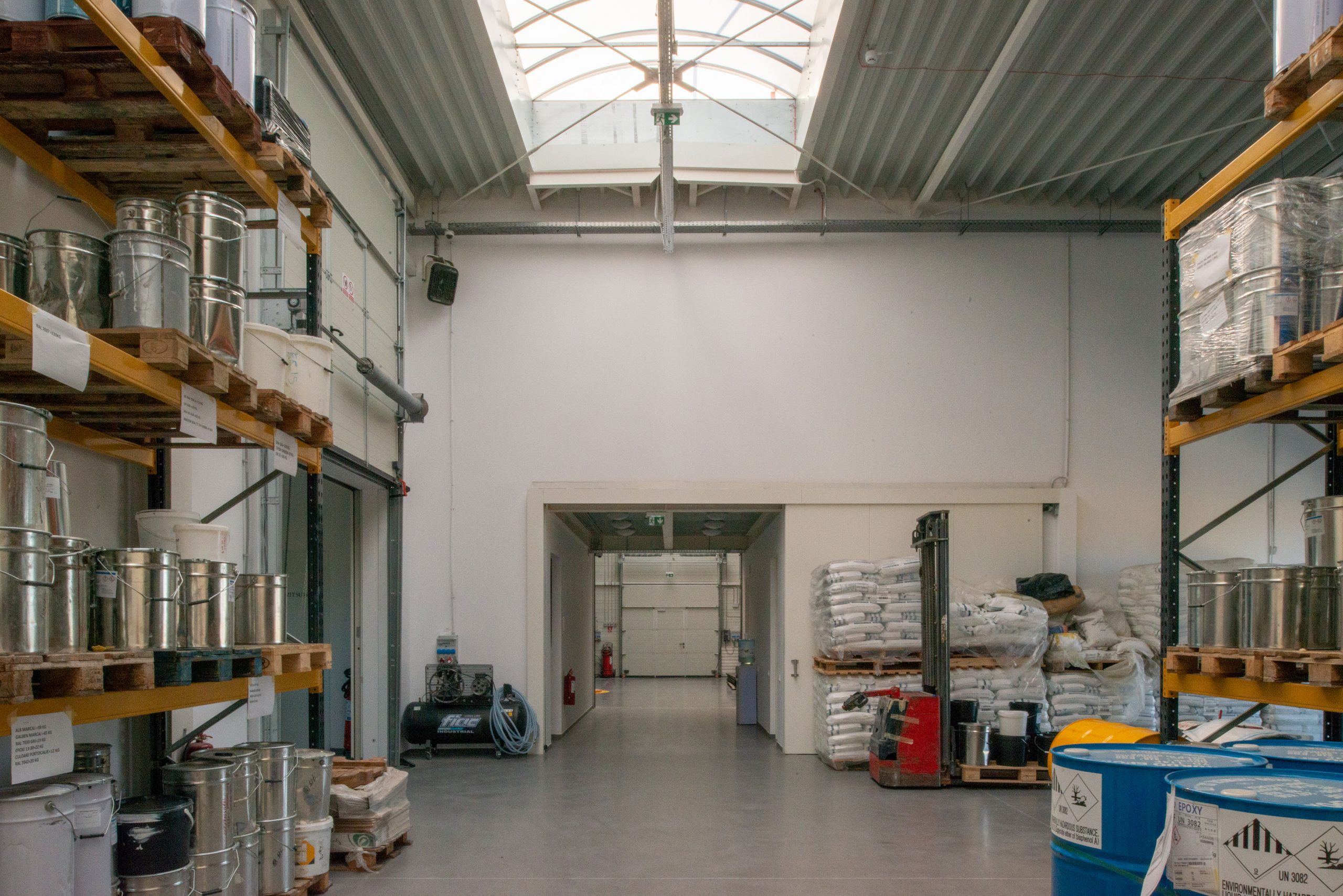
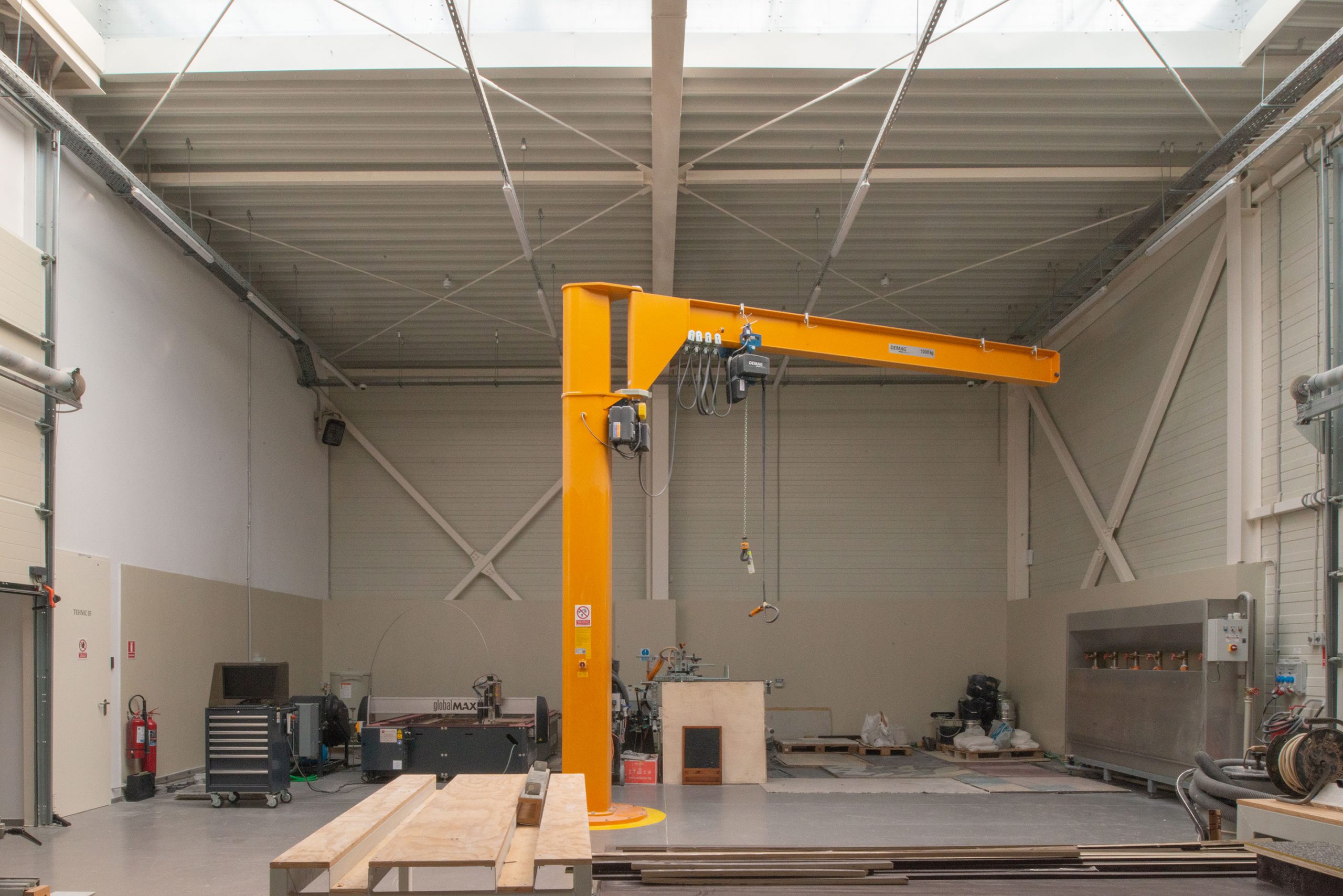
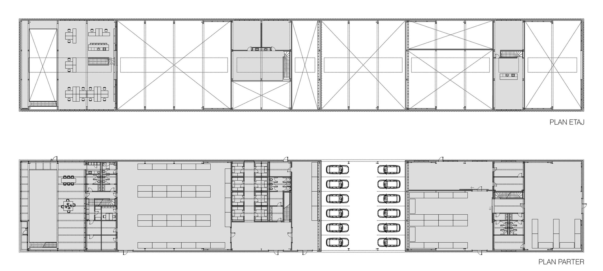
The building is the headquarters of the Aragon group of companies, a Romanian contractor specialising in terrazzo flooring, and consists of a number of complementary functions typical of this type of programme: a space for interaction with customers – a showroom for samples of terrazzo flooring and products, an office area, storage, laboratory, production areas, changing rooms, and a covered car park.
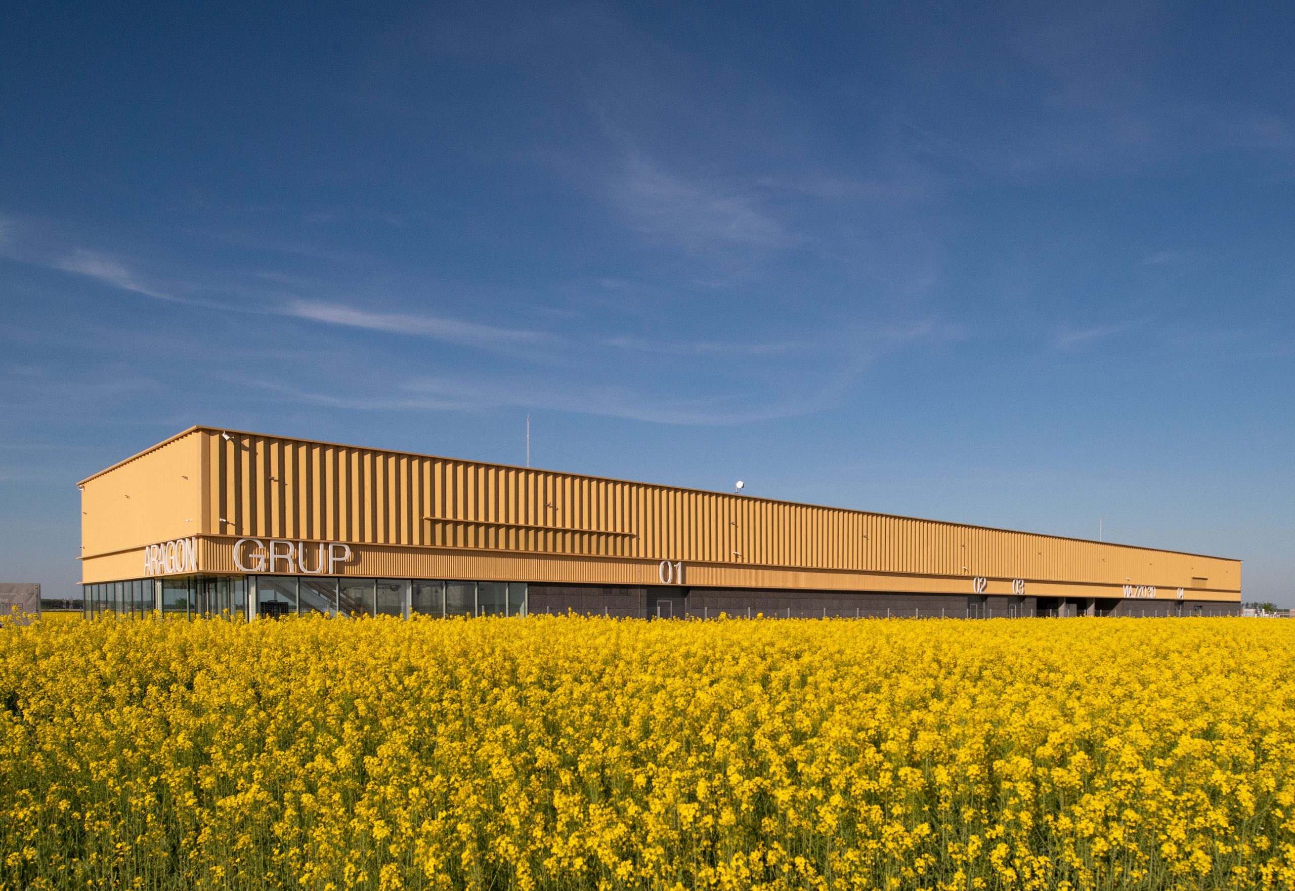
Among the elements that shaped the overall configuration of the building, the atypical proportion of the site was decisive, with a ratio of width to depth of approximately 1/10. Thus, taking into account the spatial needs of the design brief, a linear development of the future architectural object was practically inevitable. Considering the possibilities and particularities of the site, a series of functions necessary for the exhibition, storage and production processes were organised in a rational sequence.
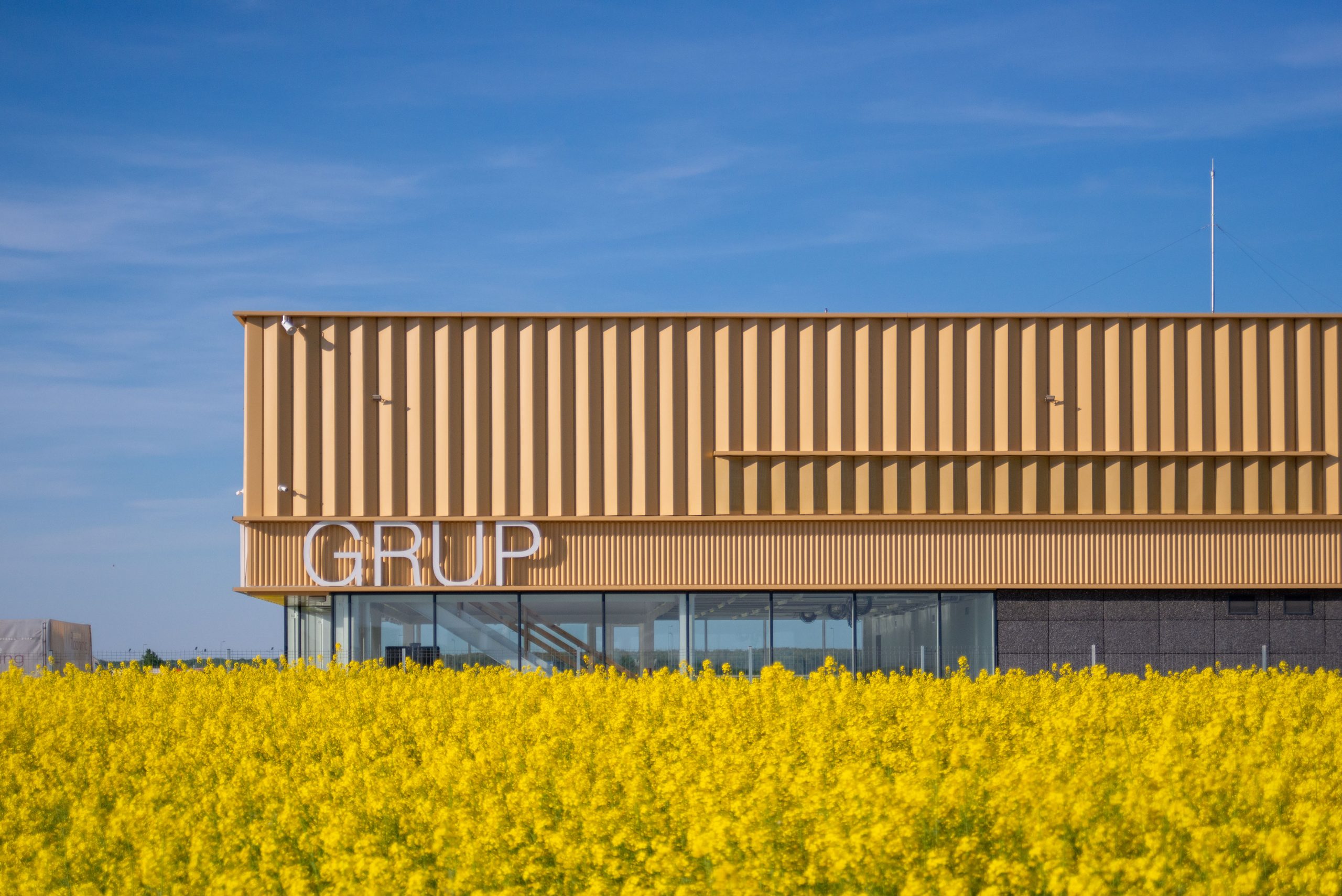
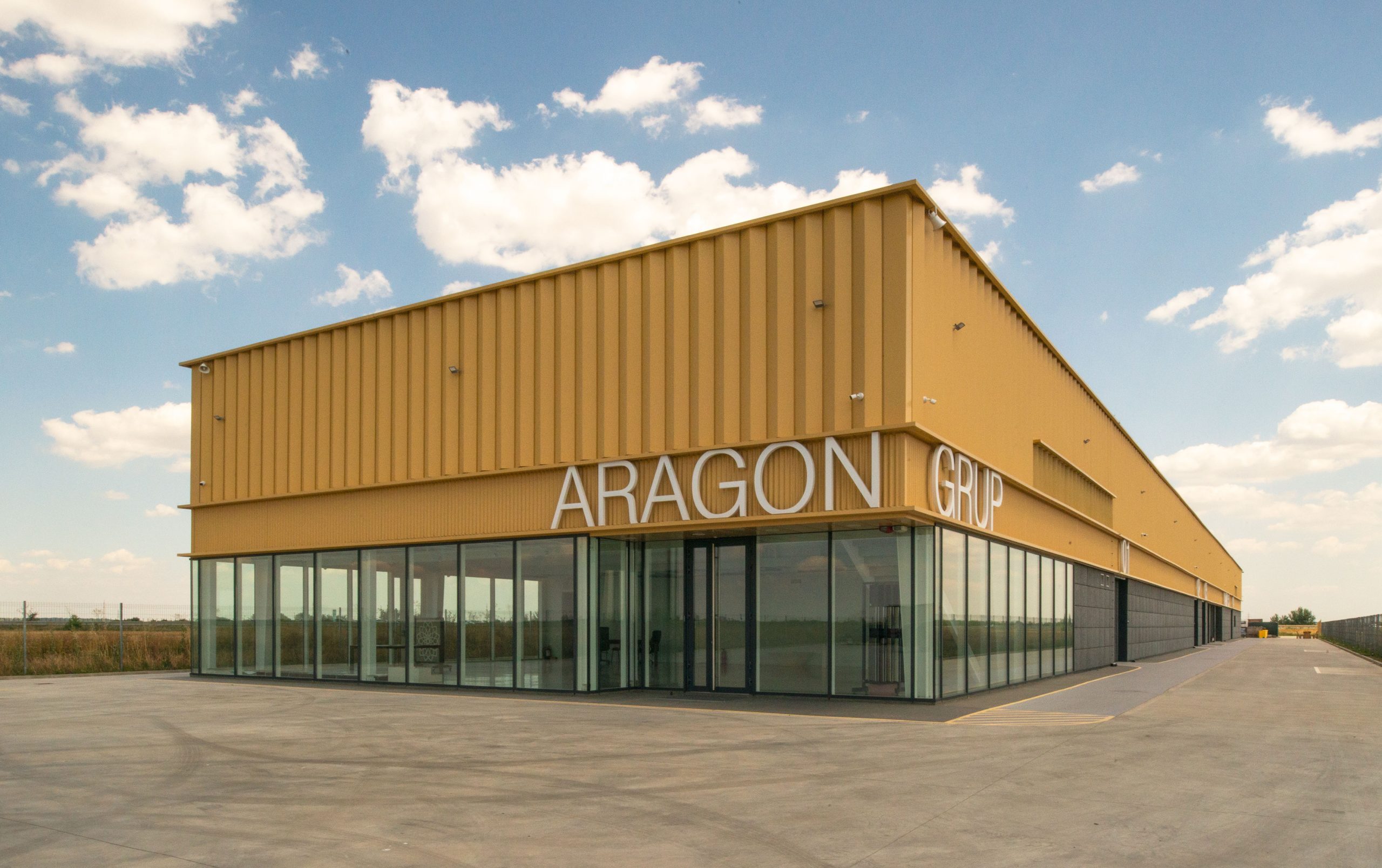
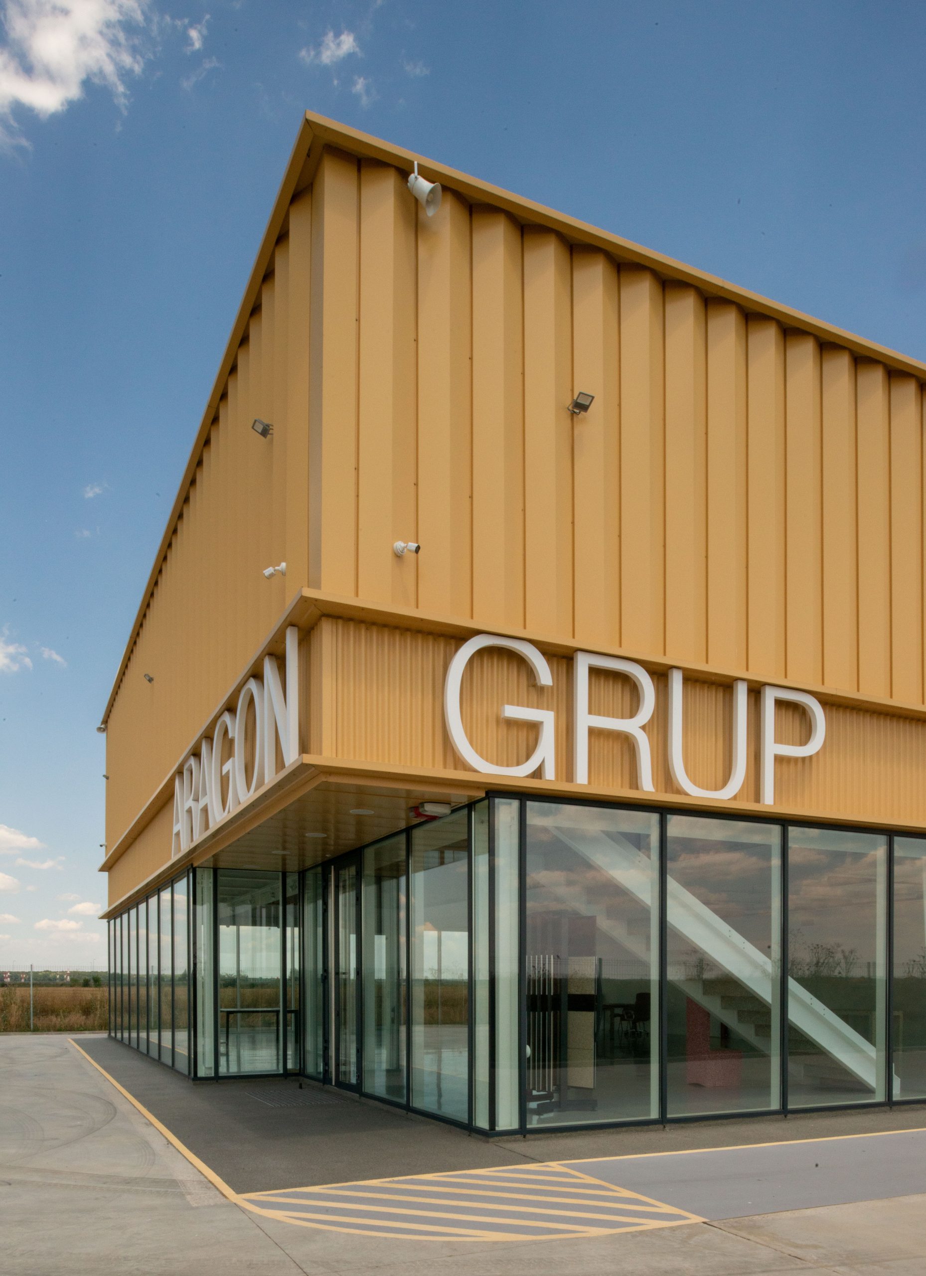
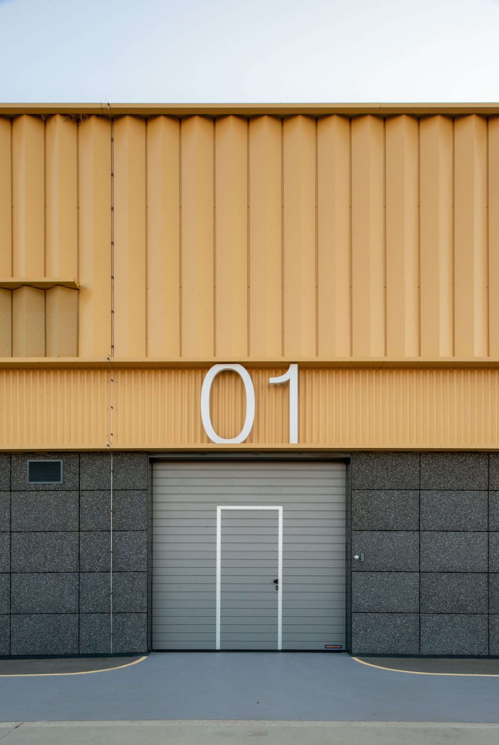
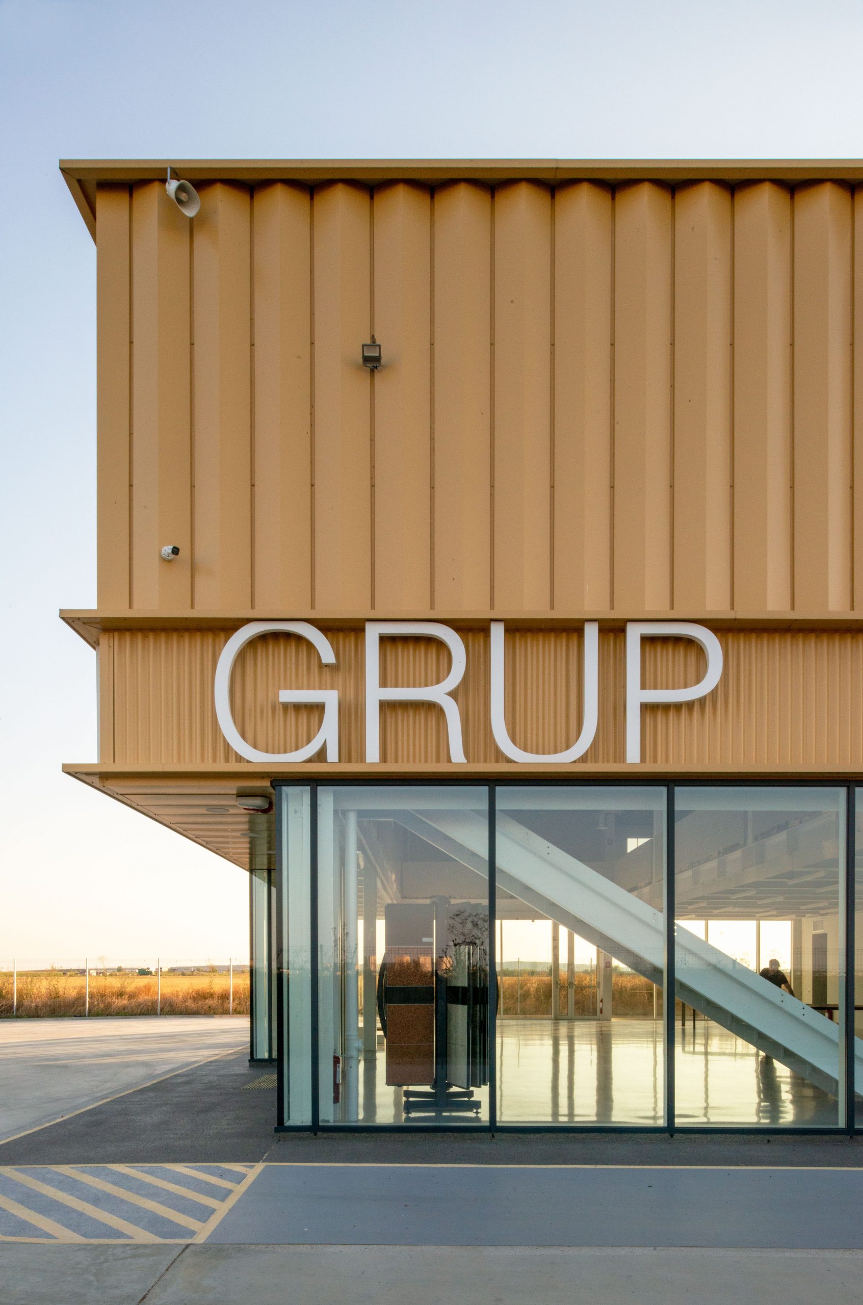
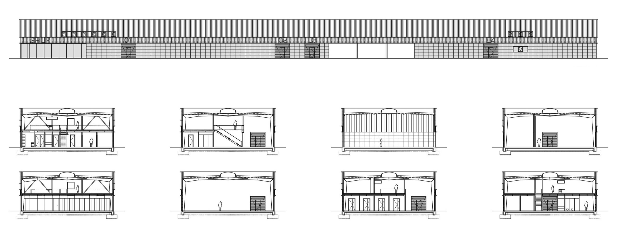
Another important point of reference drawn from the analysis of the context turned out to be the Bucharest-Ploiesti highway itself, which, despite not constituting an access to the site, represents, through its proximity, a significant viewpoint towards the building. This aspect suggested the possibility of working with the facades in an almost graphic manner, but using the oversized letters as an architectural, volumetric element. We thus also took advantage of the potential free advertising offered to the client, by displaying the names of their companies very prominently towards the highway.
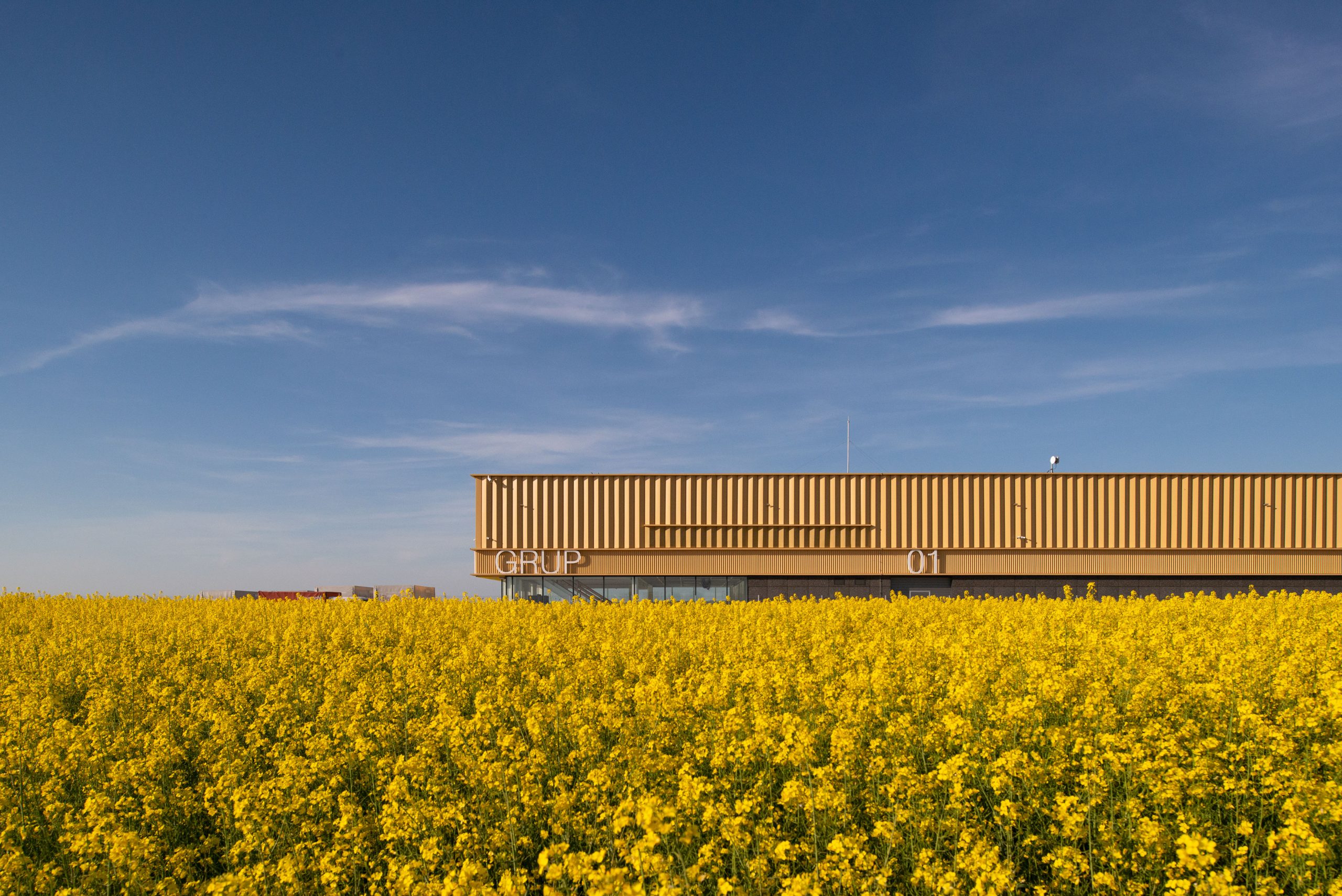
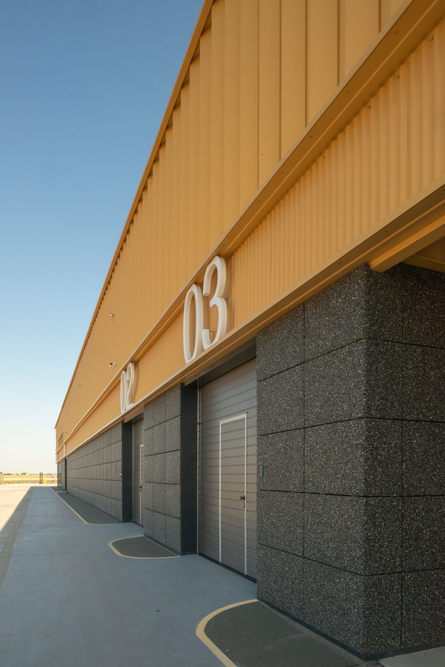
Approximately two months a year, between April and May, the fields surrounding the site, cultivated on large areas and long since planted with oilseed rape, blossom spectacularly with bright yellow flowers, an undoubtedly powerful image. Involuntarily, but rather not, this image struck us on initial contact with the site and influenced our decision to use the same colour for most of the building’s volume. In a similar logic, the very dark grey colour and texture of the ploughed earth, so characteristic of the site in other seasons of the year, also serves as inspiration for the treatment of the area where the facades come into contact with the ground. We like to imagine that, in the future, when the surroundings will inevitably be built, the image of the edifice will remain as a memory of the flowering fields of rapeseed.
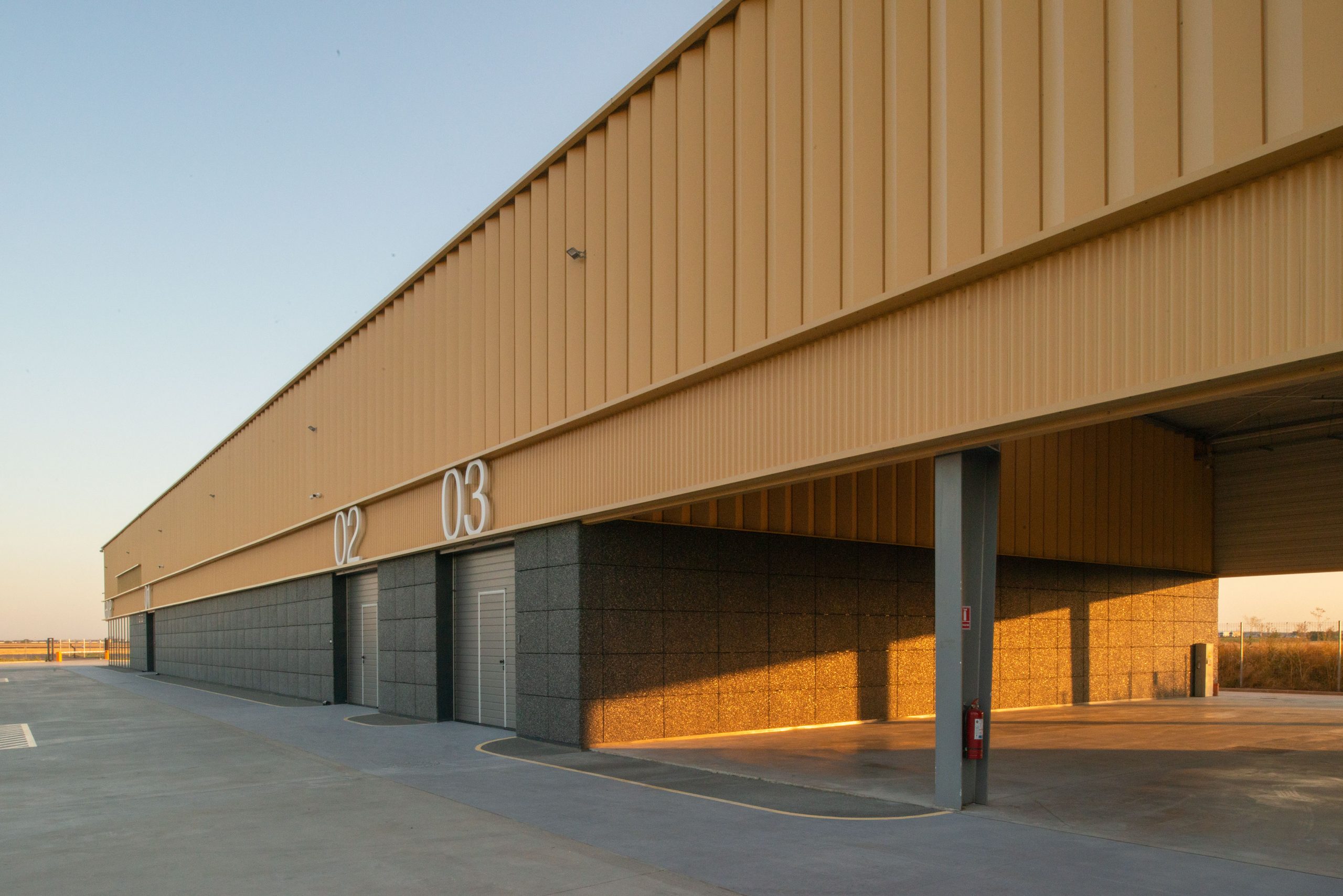
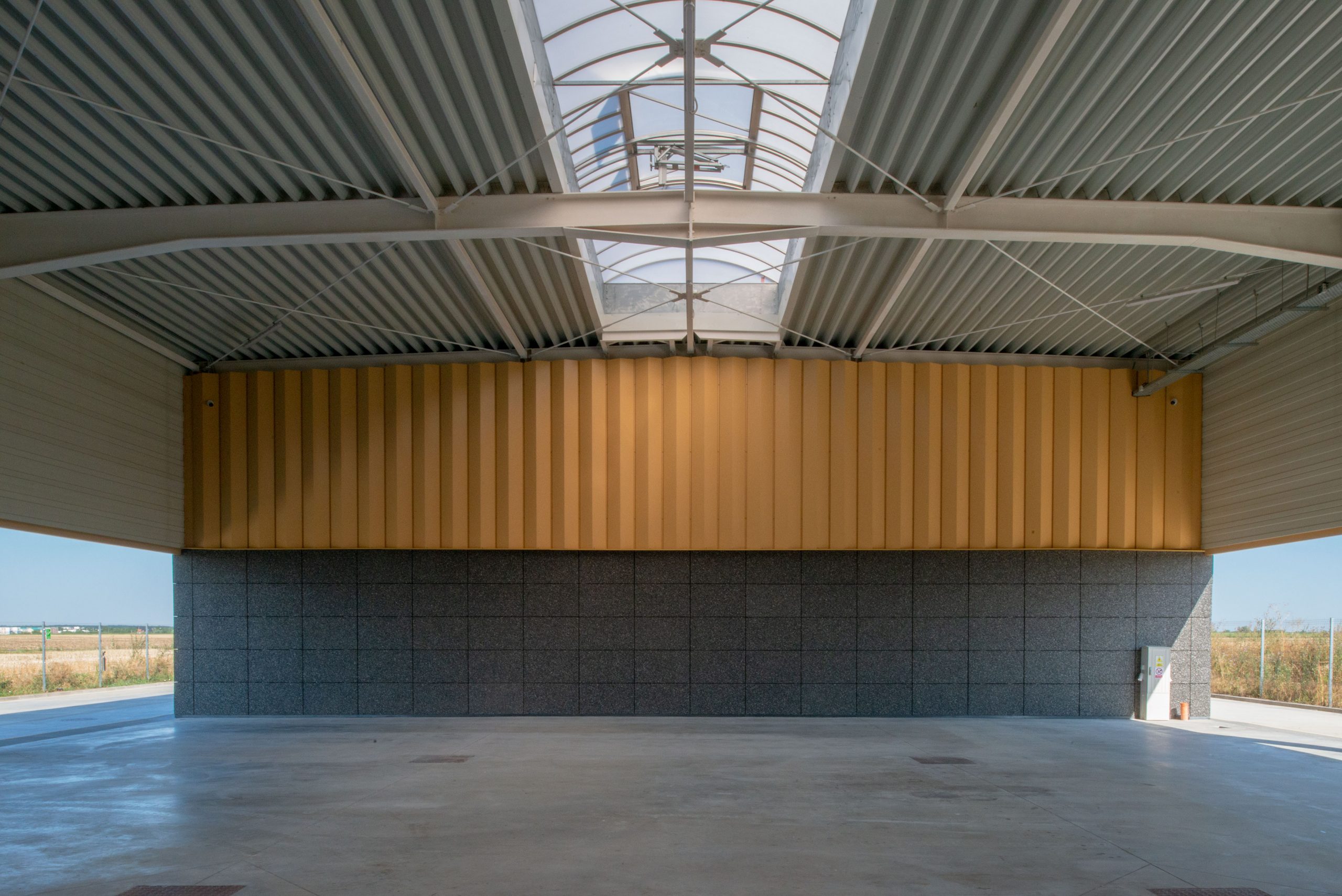
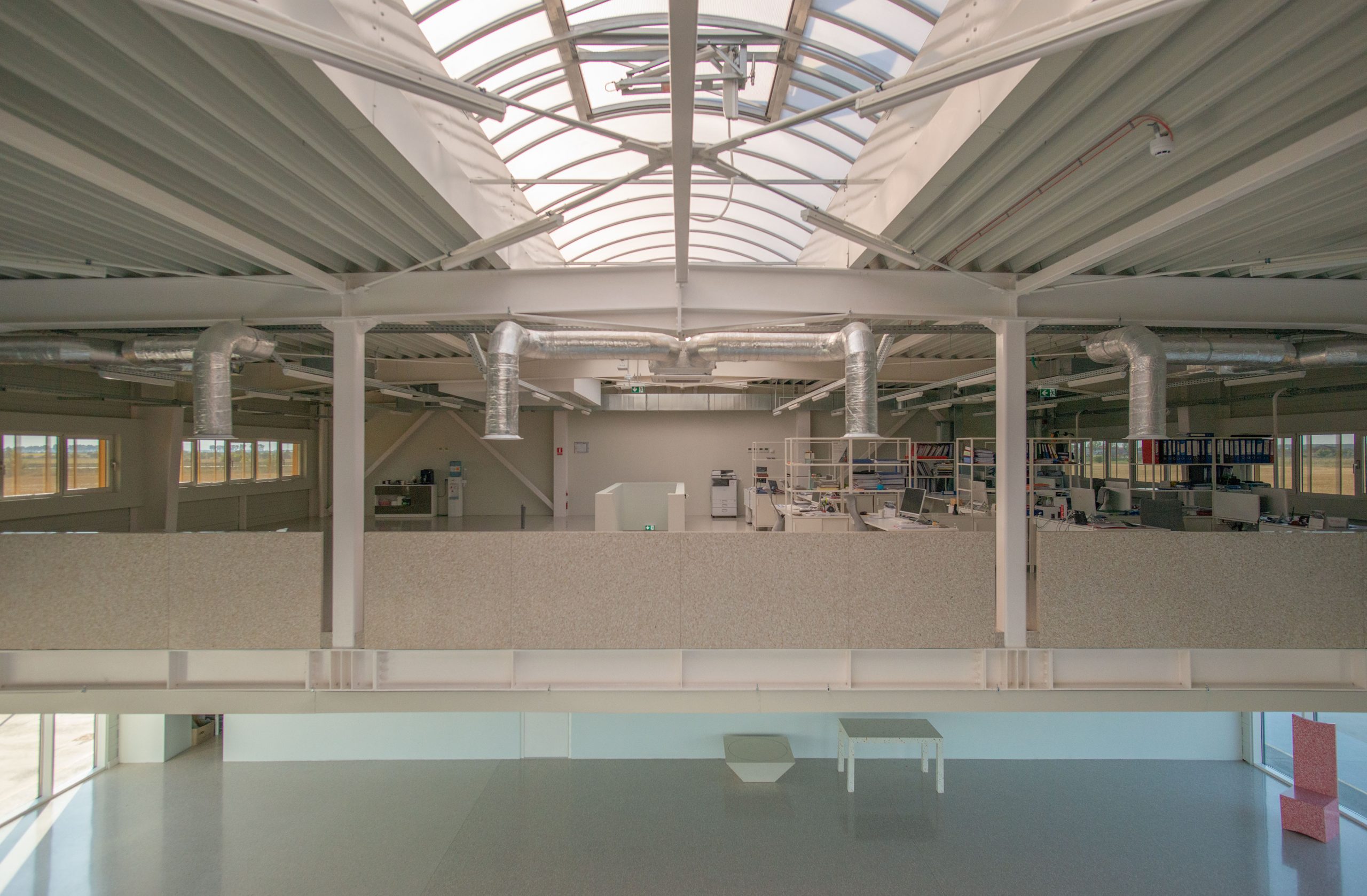
The linear spatial configuration of the building is achieved by repeating 20 times, at a 6m interval, a prefabricated steel frame with an 18m span and 6.20m clear height, allowing for the existence of overhangs or floors in certain areas, necessary for functions such as office areas, dining rooms or workshops. The dominant linearity is visually and functionally interrupted on the ground floor by a free space formed by three bays, which serves as a double-height covered parking area. This empty volume could be extended in the future, should the need for additional interior space arise (which is already becoming apparent).
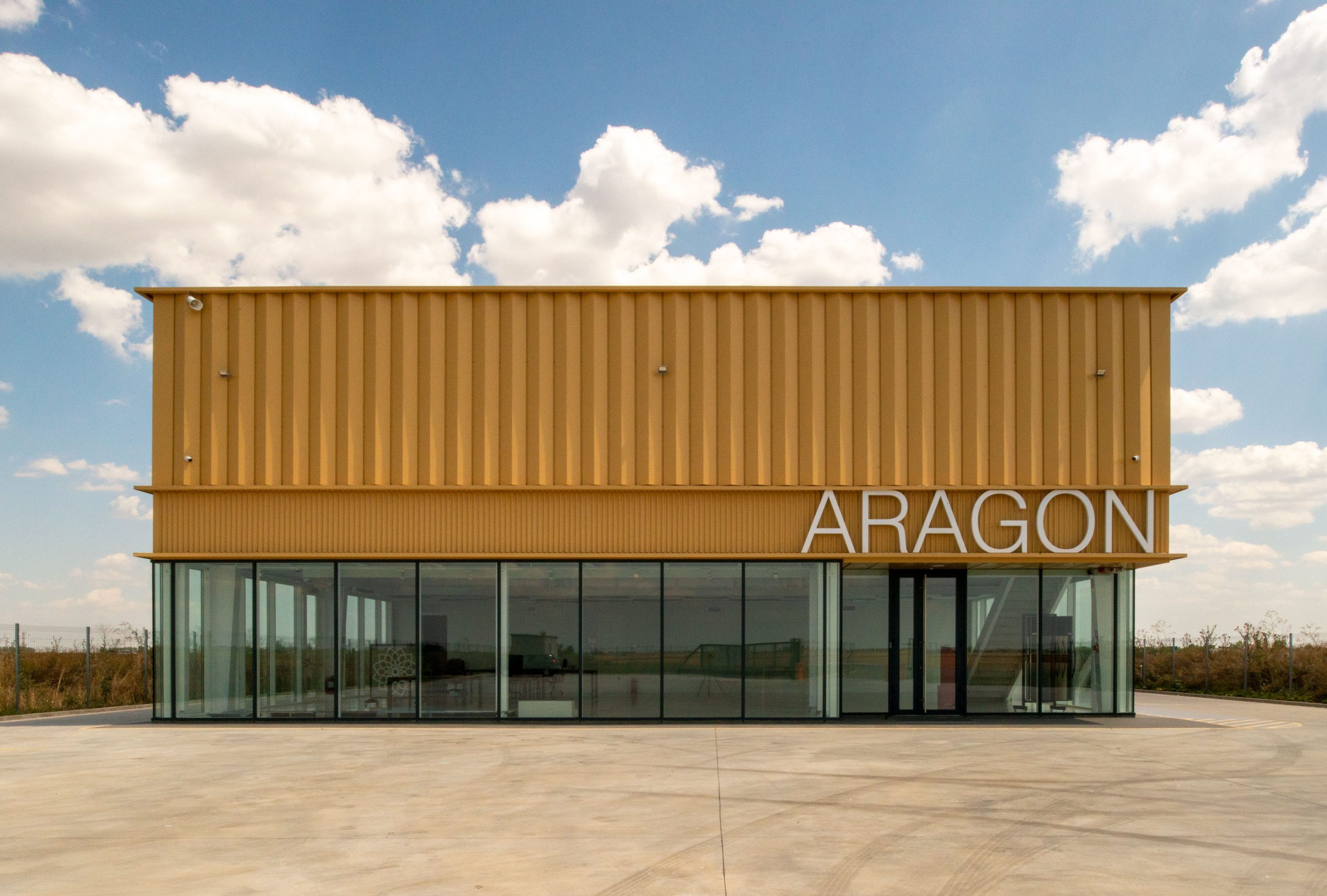
All four facades are organized in three horizontal registers, an architectural decision that emphasizes the defining characteristic of this building – its length. From a construction point of view, the ventilated facades are designed in a system of pre-painted structural metal cassettes, apparent on the inside, thermally insulated with basalt mineral wool and finished differently on the outside according to the horizontal register to which they belong. For the base one, taking advantage of the expertise and willingness to experiment of the client-builder, we tested and developed 100/60 cm panels mounted on a metal substructure, made of a material currently used for flooring, via rustik, a dark grey agglomerate made of granite aggregates bonded with a flexible, transparent, UV-stable and water-resistant polyurethane resin. The middle register, a corrugated sheet metal surface designed to serve as a backdrop for 125 cm high, matt white pre-painted, back-lit volumetric metal letters, advertises the owner, marks all entrances and is demarcated from the other two by protruding horizontal profiles. The upper register is finished with vertically arranged triangular cross-section strips of pre-painted sheet metal. The upstairs windows are masked and protected, at least during the day, by the same vertical elements, but in finely perforated sheet metal.
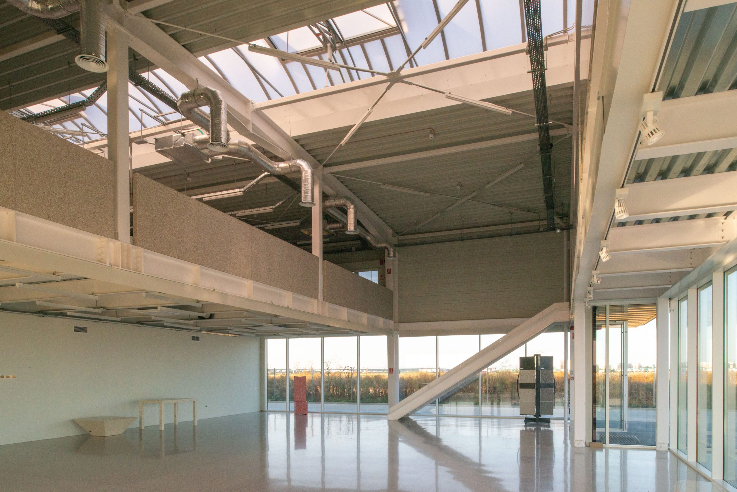
The interior spaces, regardless of their function, adopt an industrial aesthetic, with structural elements, slab undersides and cladding of sheet metal, electrical and ventilation installations all exposed, which together contribute to the overall architectural expression. Given the specific nature of the Aragon group of companies’ activity, particular attention has been paid to floors of different types, in accordance with the functions they serve. The heavily glazed showroom area in direct contact with the access road and the office space on the mezzanine floor have terrazzo floors, a noble surface, in a desired contrast with the austere appearance of the rest of the elements that define the interior atmosphere, while industrial floors were used for the rest of the spaces, whether warehouses, production areas, laboratories or changing rooms.
