Izbiceni Street Office Building, Bucharest
View project description2012Commercial Izbiceni Street Office Building, Bucharest
2012 / Commercial / Izbiceni Street Office Building
Mention, Single Family Houses Category, Bucharest Architecture Annual 2012
President’s award, Bucharest Architecture Annual 2012
Location: Bucharest, Romania
Project Status: Built
Architecture: E+EA – Mihai Ene, Ştefan Cristescu, Adela Ene
Structure: Profesional Construct Proiectare – Paul Ioan, Corina Doroftei, George Nestor
Client: –
Surface: 2580 sqm
Period: 2008 – 2012
Photographs: Mihai Ene
The design brief, predictable in the case of such a programme, included making the most of the site in terms of usable surface, within the limits of the regulations of the area and a truly reduced budget. To cover those requirements, we imagined, from the very start, a pragmatic strategy, the only one able to manage reasonably both the architectural issues, as well as the financial ones; the main tools of the project were the condensed language, the economy of means and the clarity of the architectural gesture.
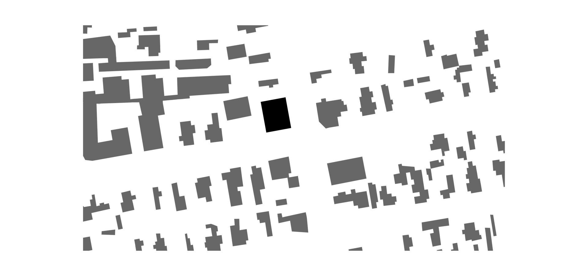
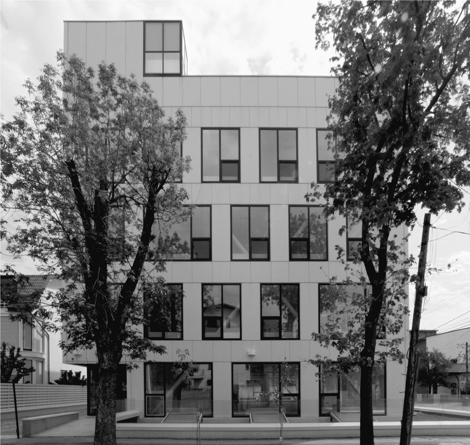
The site is placed in the North of Bucharest, in Damaroaia neighbourhood, a quiet residential area, lacking architectural values and featuring a dense structure of small plots. It resulted from the merging of two such plots, placed at the joint of Natatiei and Izbiceni streets.
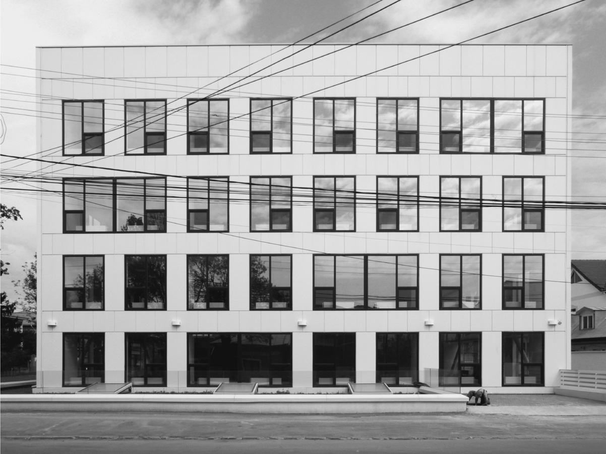
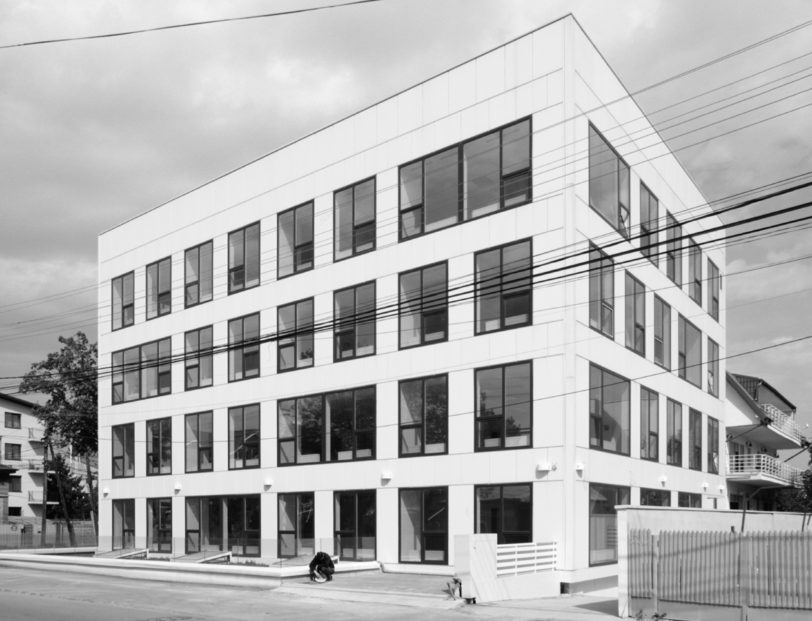
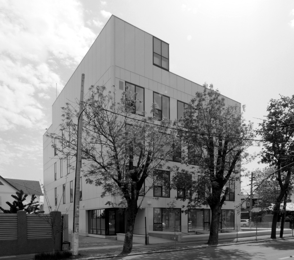
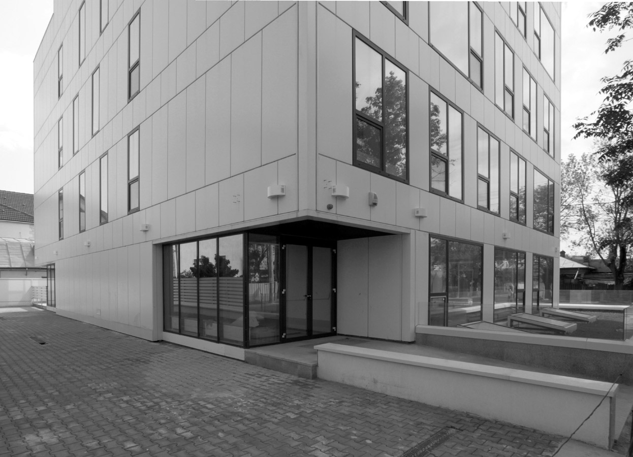
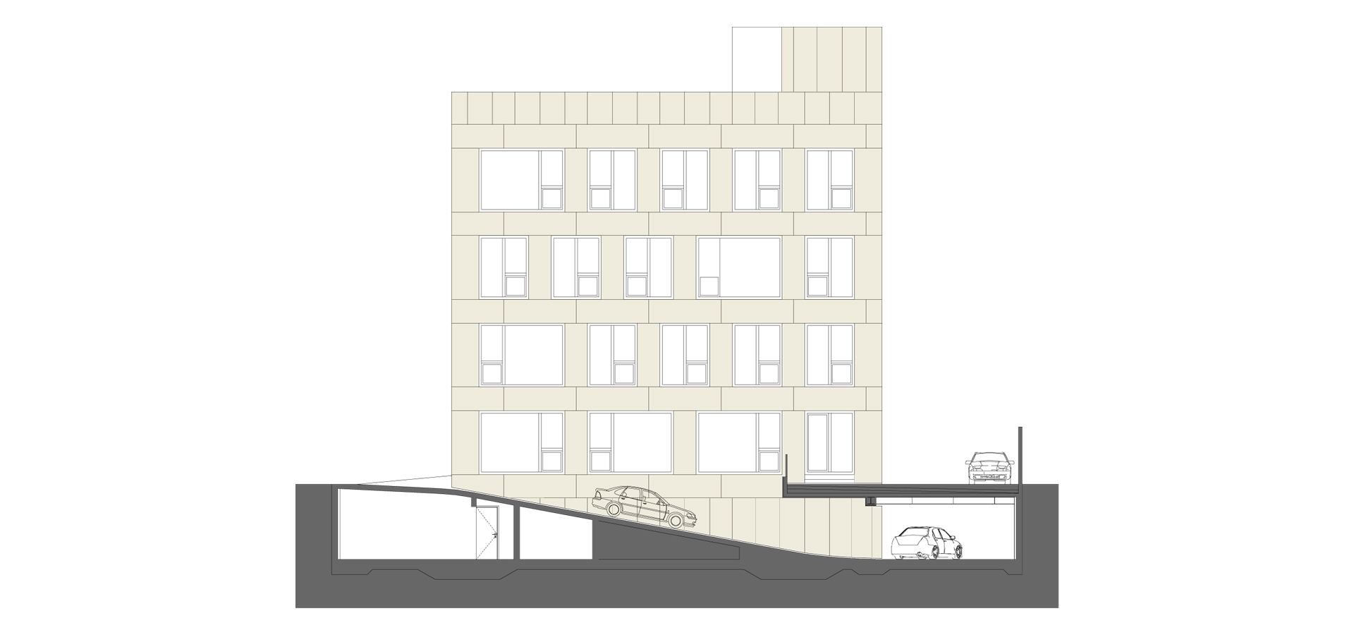
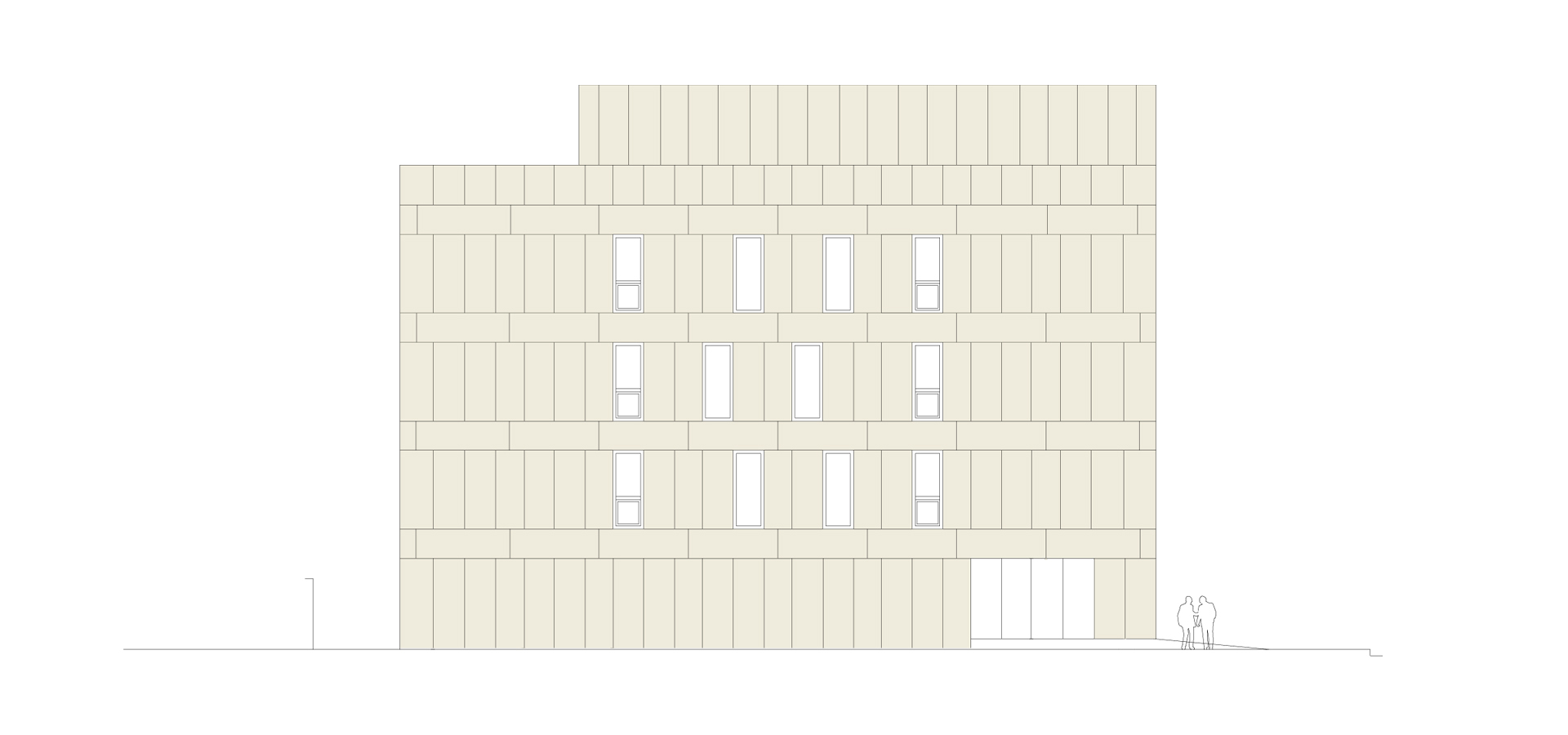
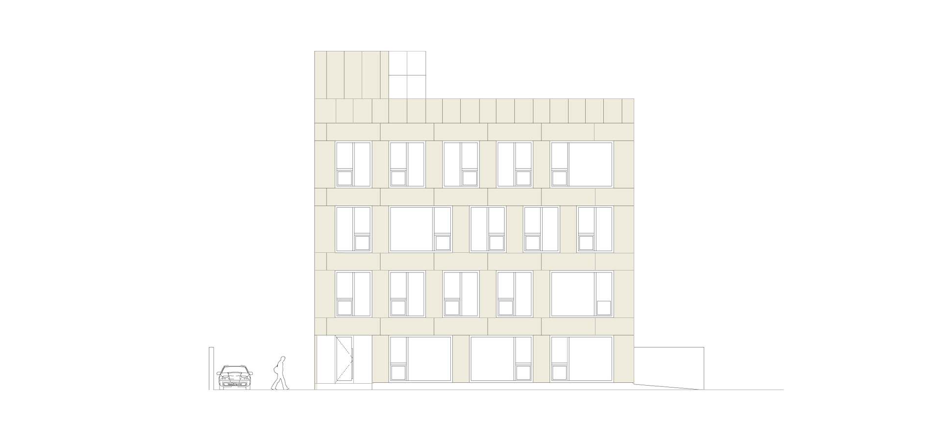
The primary volume is a direct result of applying the compulsory set-backs and the maximum allowed heights stated in the urban-planning regulations: a P+3 box. This goes through a minor manipulation – the dislocation and translation on the vertical of a prism on the Northern facade, aiming to mark the entrance and allow the exit on the walking terrace.
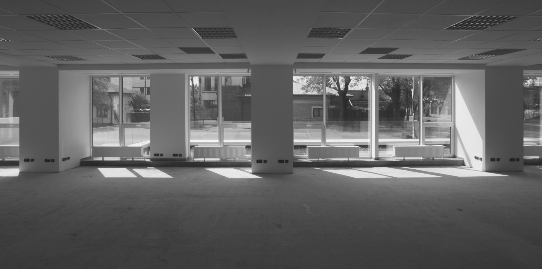
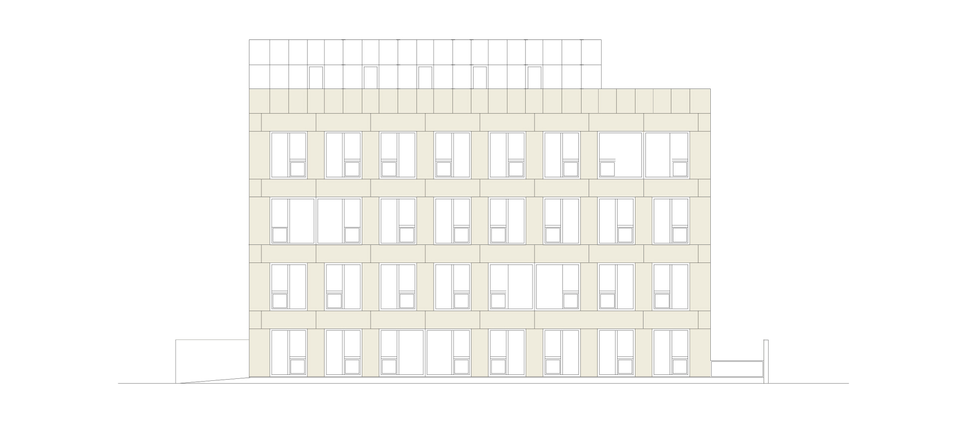
Both us, as well as the clients, wanted from the start to avoid curtain walls, architectural element turned into a cliché, and, actually, unfriendly to the environment and unprofitable economically in use. Therefore, all facades, except the Northern one, are roughly 55% transparent and rely on a single type of vertical opaque element, and three types of apertures coming out from the same module. The modulation and recurrence are, in fact, the principles defining both the plan, as well as the facades.
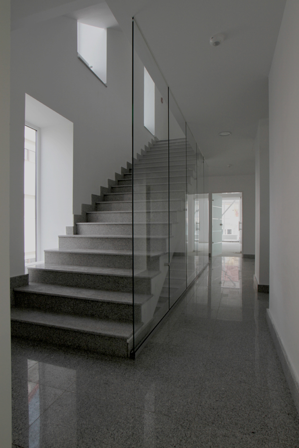
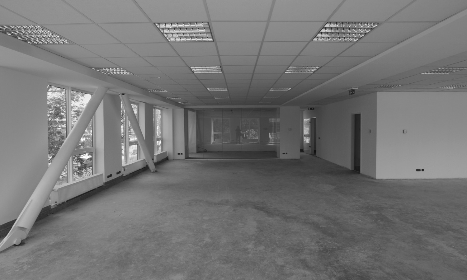
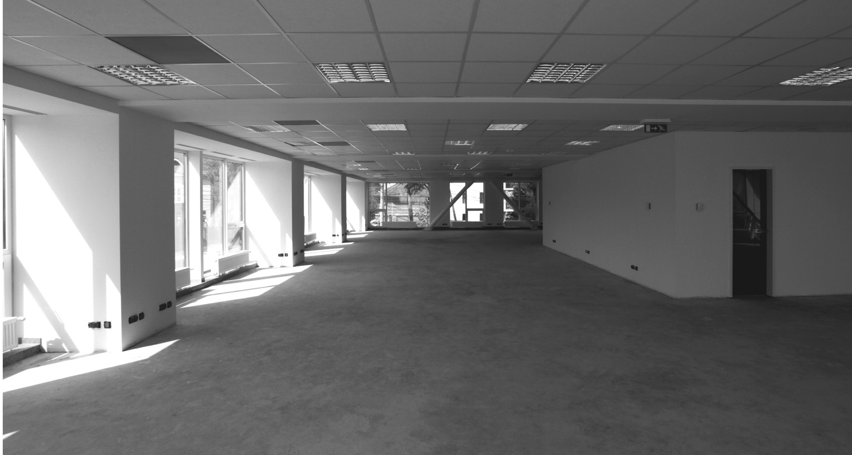
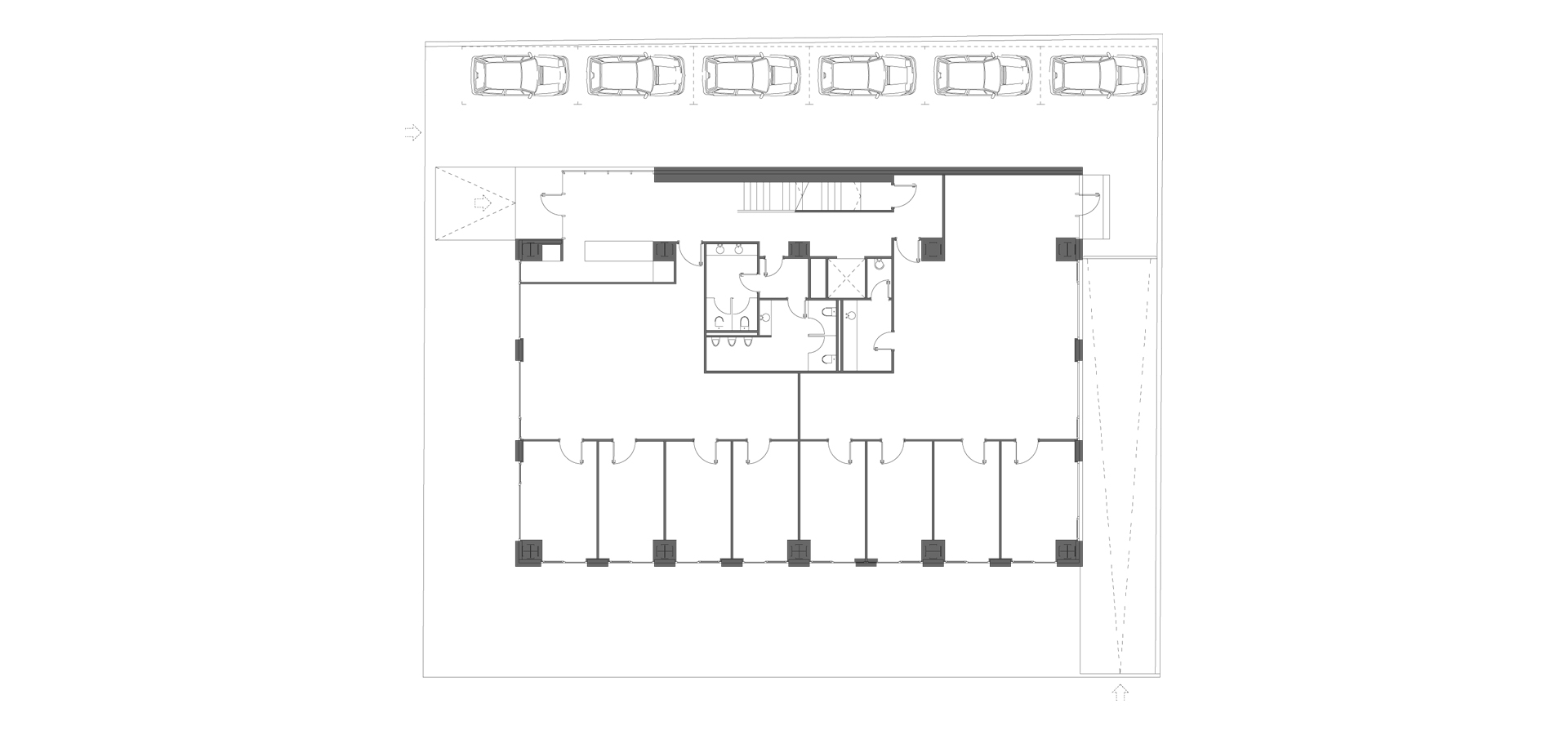
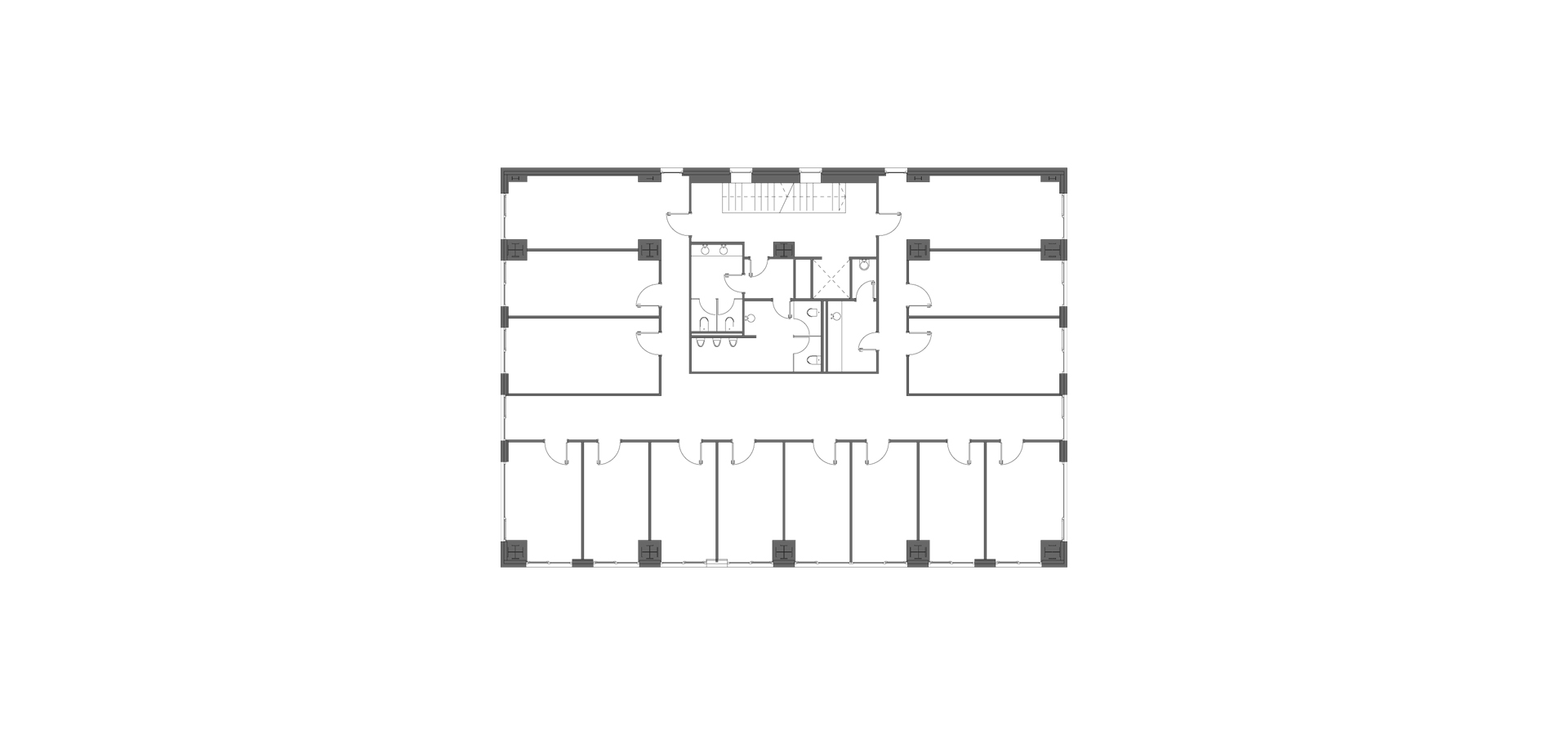
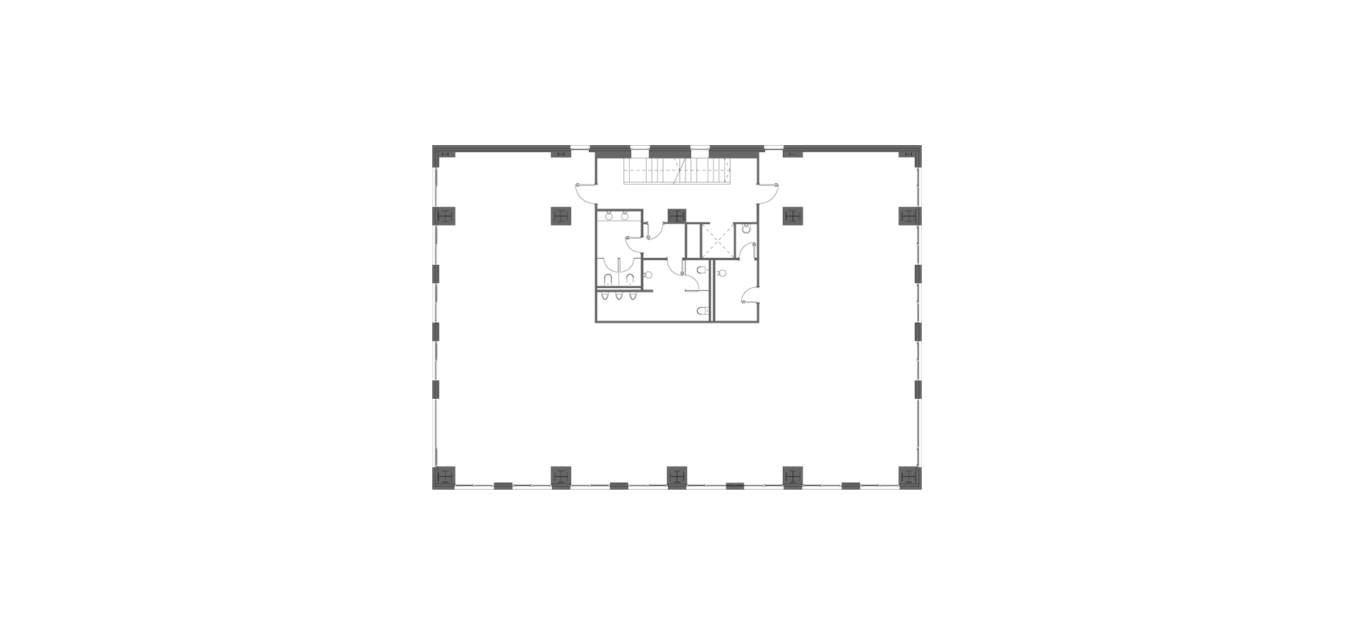
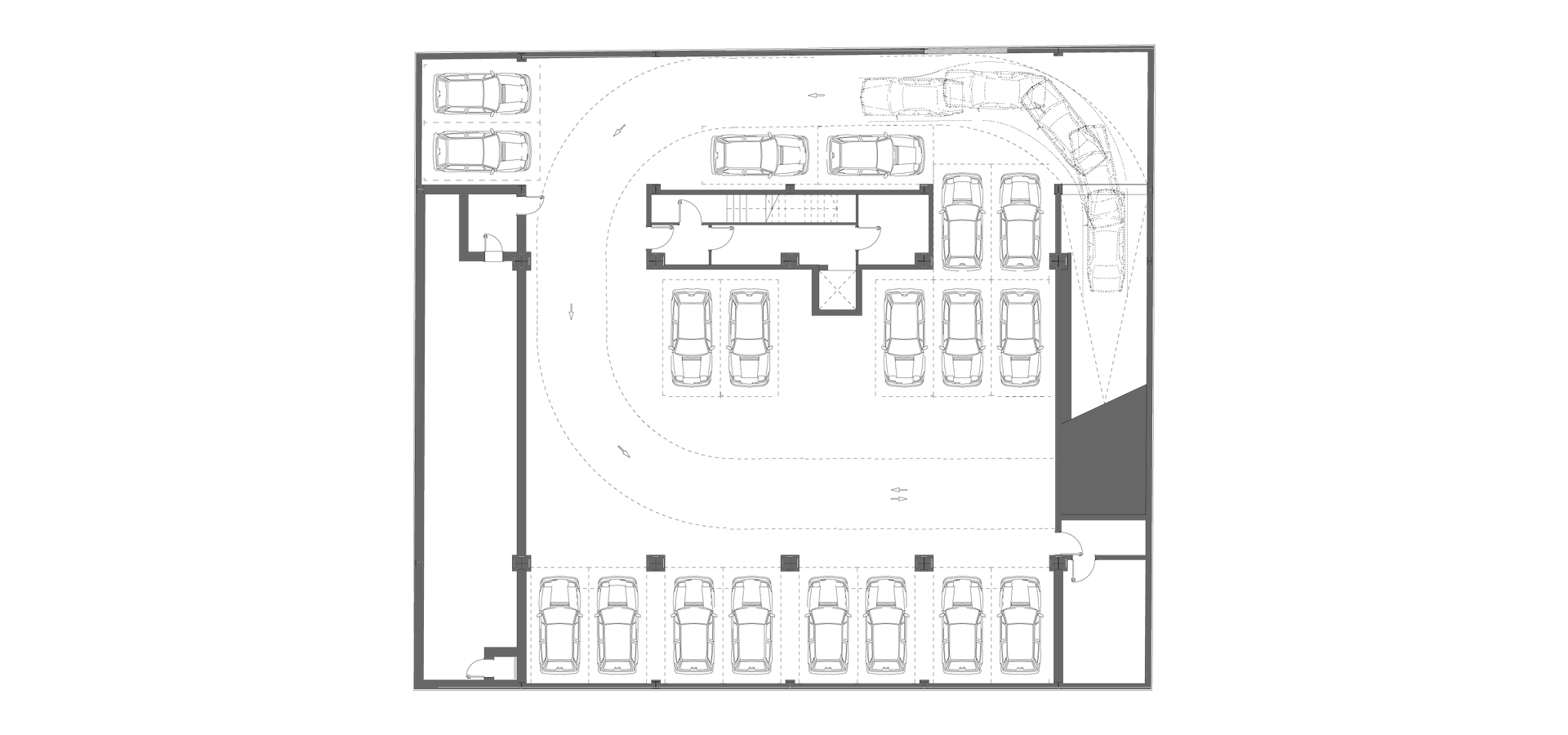
The interior is spatially organized by the staircase and the eccentric functional core. Economic reasons asked for a spatial flexibility typical to this programme, as well as the opportunity of renting for maximum two tenants per floor. As the same time though, the spaces can work as open-space offices or can be divided in individual units with a minimum width of 2.90 m. The basement occupies the whole surface of the plot, and allows the parking of sufficient vehicles.
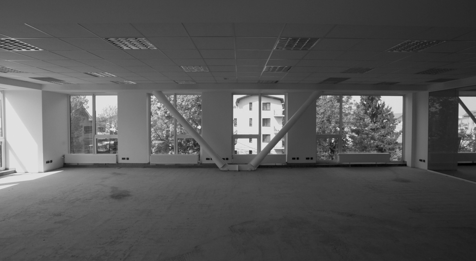
The structure – metallic – has a rational and symmetrical setup, being almost exclusively disposed on the perimeter: four spans on the long side, a 13 m opening with 3.5 console extended on the short side.
Yet the clarity of the structure is not so obvious as the facades, where the ambiguity resulting from the difference between the span and the opening. As a result, the recurrent vertical continuity of the structure on the Southern facade is not found on the two short facades, where the vertical elements are shifted. The fact that this is not a Load bearing facade but a skin clothing the building is thus expressed.
